
41zero42
Most specification decisions can be revisited. Tile cannot. It goes down, it stays down, and it reads — accurately — as a statement about how the organisation thinks. Which is why it deserves more than five minutes in a catalogue.
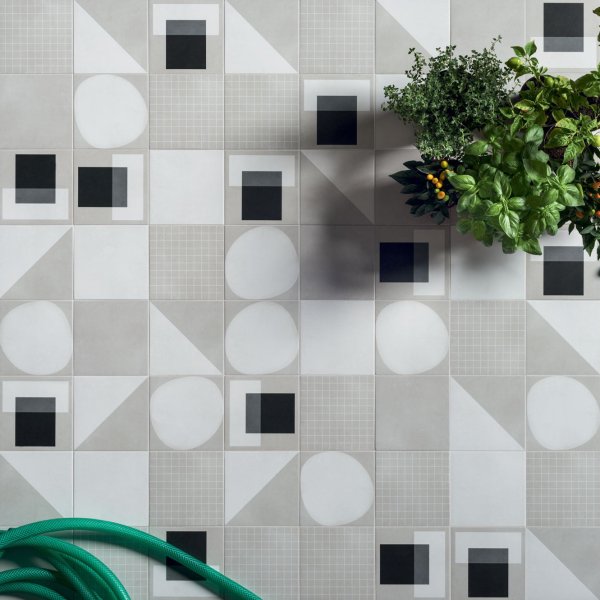
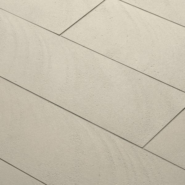
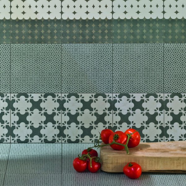
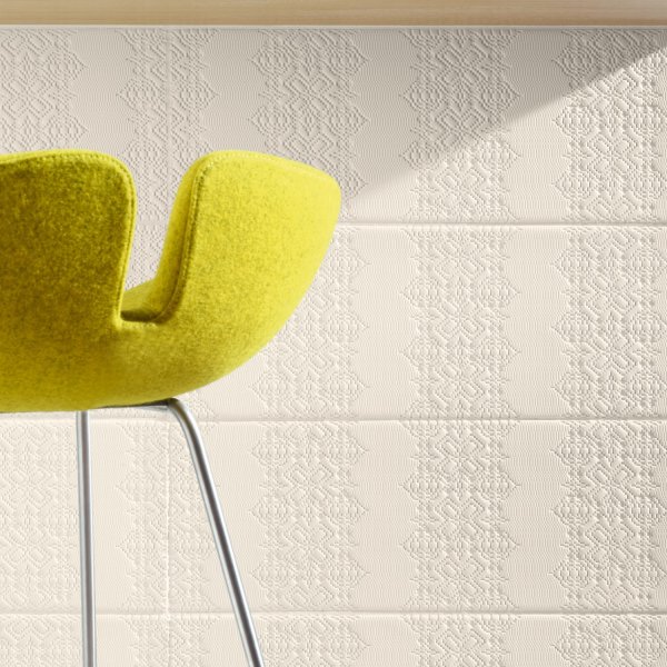
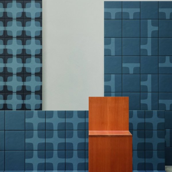
The ceramics in this collection are Italian, developed through collaboration between manufacturers and design studios who treat the tile not as a commodity but as a designed object. Surface relief that changes character through the day as light rakes differently across it. Large-format porcelain that removes grout lines from executive corridors entirely — not as a cosmetic exercise, but because continuity of surface is what creates the sense of intention that expensive furniture alone cannot manufacture. Palettes developed to work with the tungsten, LED and daylight conditions that coexist in almost every commercial building.
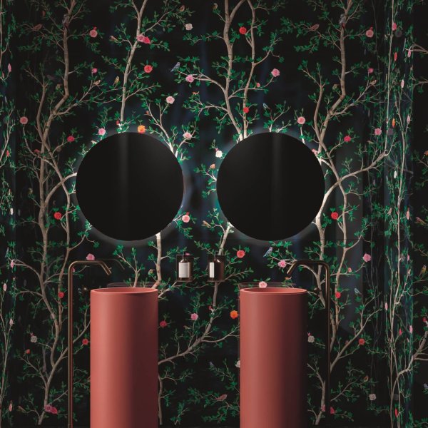
Where the investment makes sense. The executive washroom is the clearest case: it is the only space a visitor occupies without an audience, and the conclusion they draw there is unfiltered. A reception feature wall works differently — it is seen by everyone, briefly, and remembered longer than most people expect. Connecting corridors and transition spaces are where coherence is usually lost and where it is most conspicuous when it holds. Break-out areas that share a material language with the formal spaces around them tend to feel considered rather than assembled.
How to choose without regret. Technical requirements first: slip resistance (R9 minimum for wet areas), abrasion rating matched to footfall, water absorption appropriate to the surface type. Then light — always on site, never from a photograph. The same tile reads differently under warm halogen and cool LED, and it reads differently again at forty square metres than it does as a 200mm sample in hand. Request large boards. Assess them in place. Specify by collection name, colour reference, format and finish — never by description, which is an invitation for substitution. Include the special pieces: edge profiles, transitions, external corners. They are what separates a finished installation from an approximate one.
Browse the collection, request physical samples, or speak with the team about specification support.
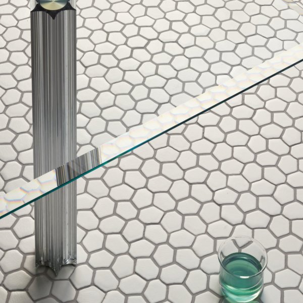
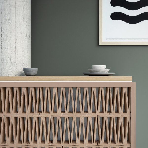
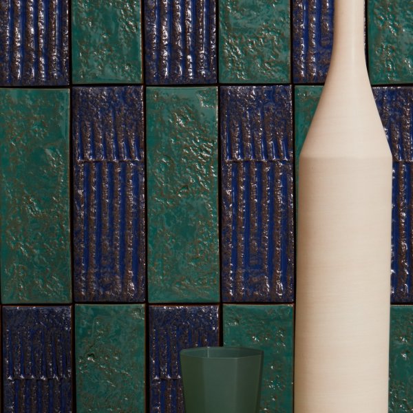
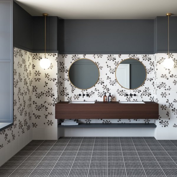
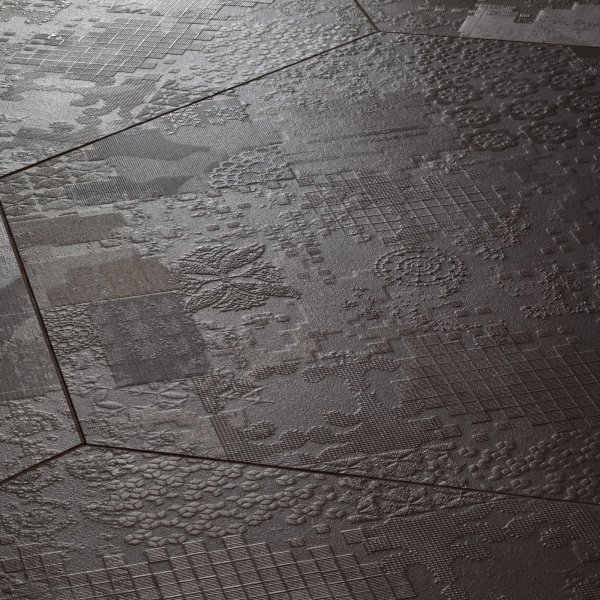
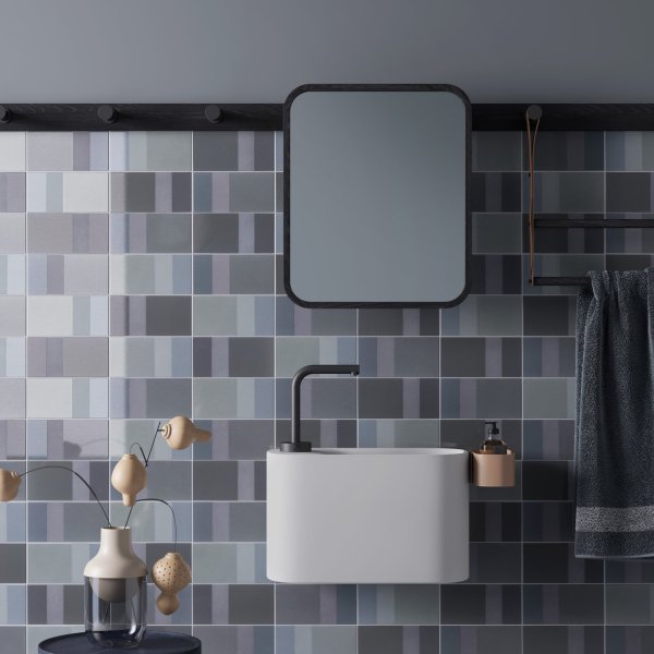

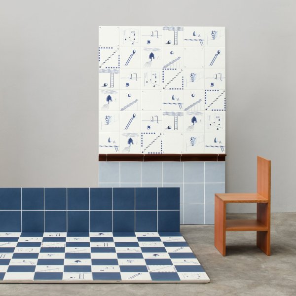
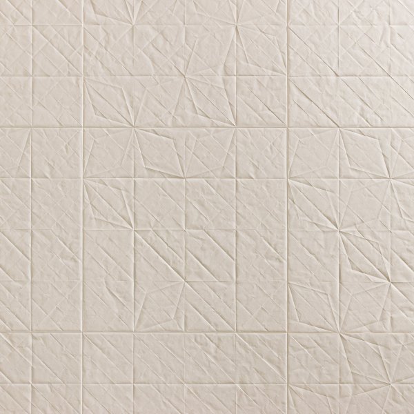
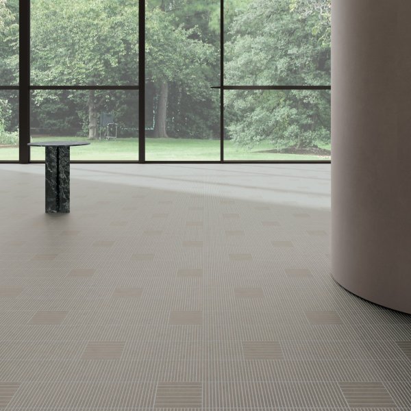
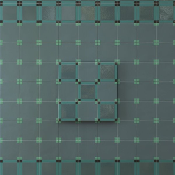
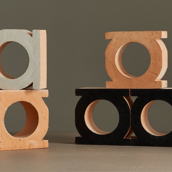
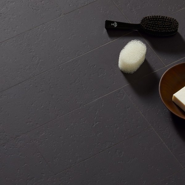
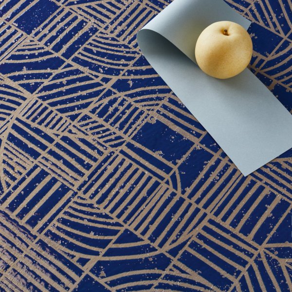
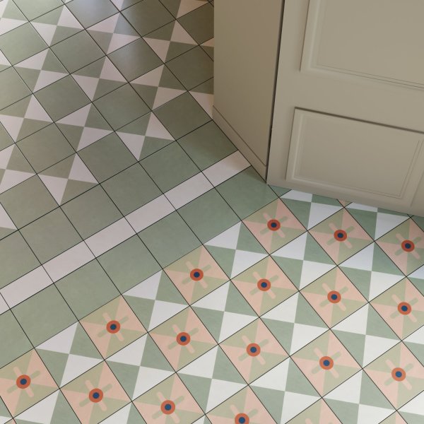
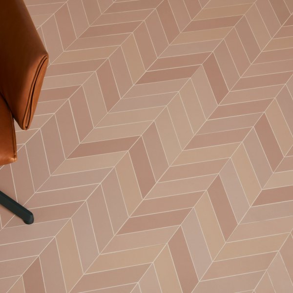
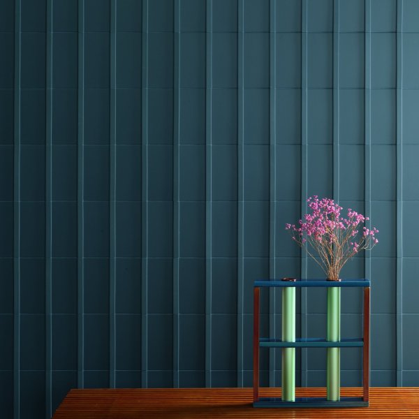
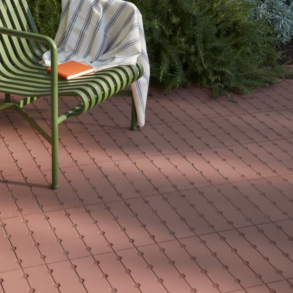
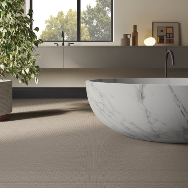
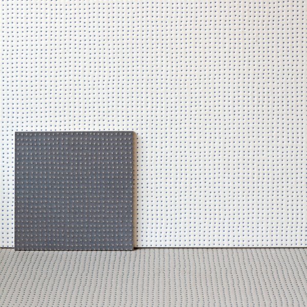
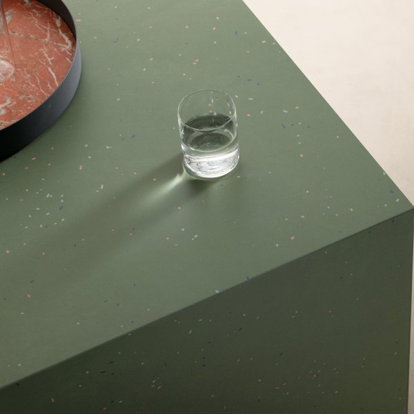

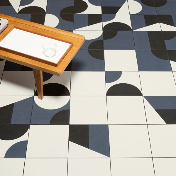
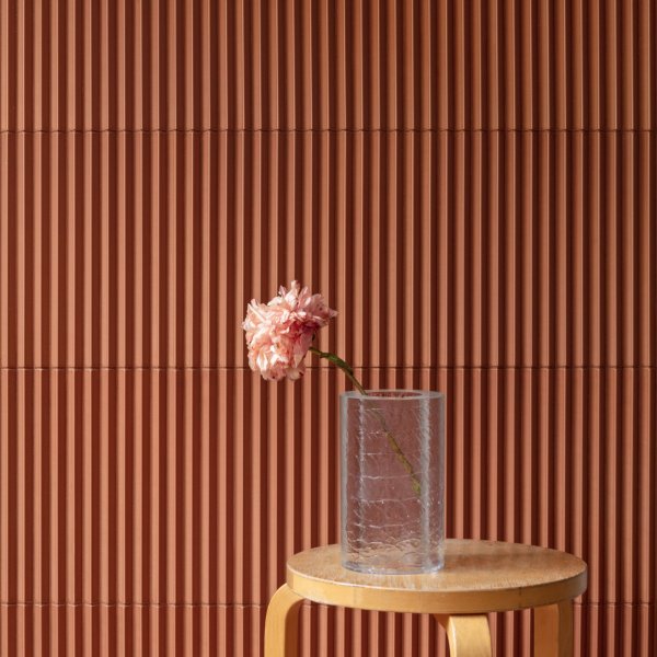
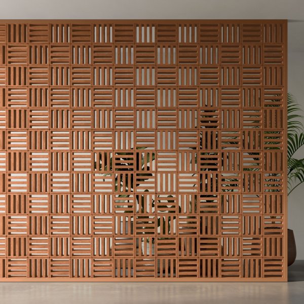
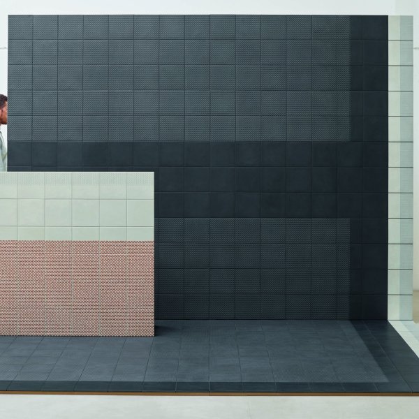
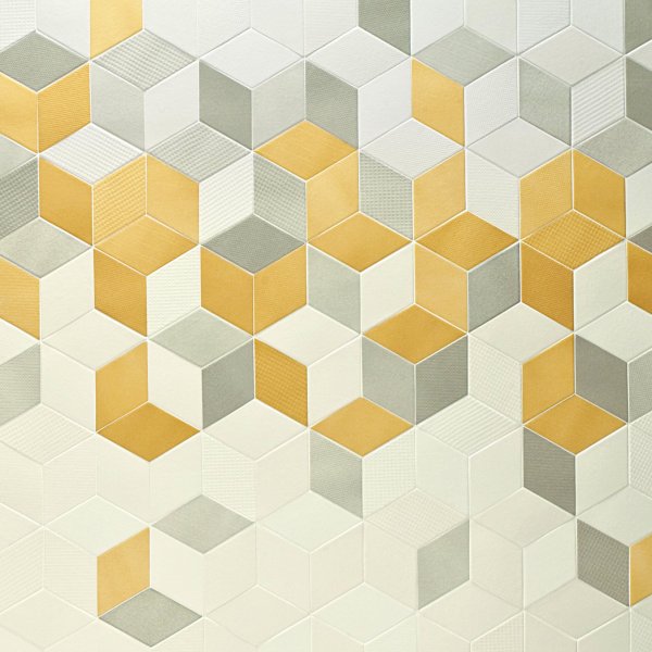
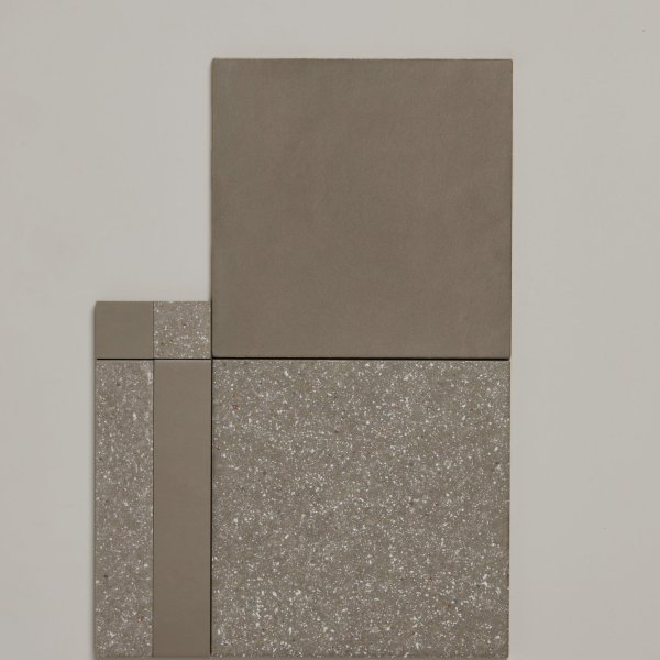
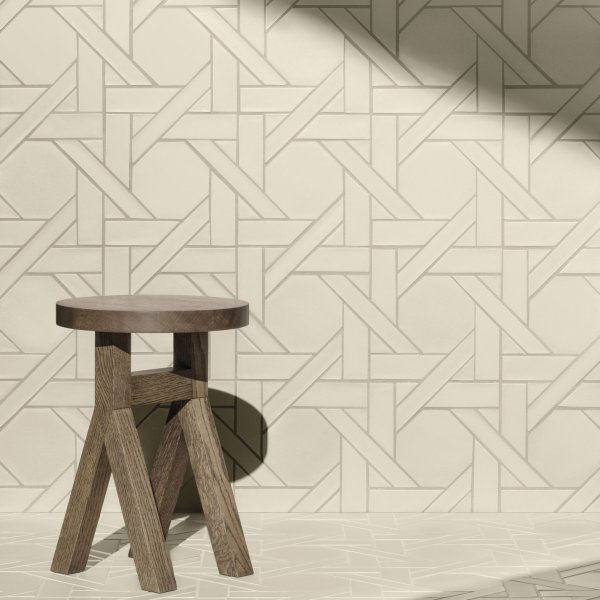
The premium reflects development cost, not raw material. The collections we carry are produced in collaboration with design studios who specify surface behaviour, dimensional tolerance and batch consistency at a level volume manufacturers don't attempt. In practice this matters most where it's most visible: executive washrooms, reception feature walls, long corridor runs where a calibrated palette holds its character over years rather than months. For back-of-house or low-visibility applications, a volume tile is perfectly rational. For spaces that represent how an organisation thinks — and that will be seen, daily, by the people whose opinion matters most — the Italian collections are rarely the wrong choice. La Mercanti selects specifically for these contexts: not the widest range, but the right one.
The opposite, when it's done well. The collections we carry are designed to travel across environments: the same material DNA expressed in different formats, finishes and laying patterns depending on what each space requires. Using a single ceramic family from reception through corridor to executive washroom is not a shortcut — it is the decision that gives a building its sense of authorship. The spaces feel connected rather than assembled. La Mercanti selects specifically for this: collections conceived to inhabit multiple environments together, not single products that work in isolation. The brief question to ask of any collection is whether it has range — and range is what separates Italian design ceramics from most of what the volume market offers.
It depends on what the space needs to say — and what you are prepared to invest over time, not only at purchase. Natural stone brings absolute uniqueness and a physical presence that is genuinely difficult to replicate. Italian design ceramics — large-format porcelain, slim profiles, surfaces that reinterpret stone with considerable precision — offer better performance in working buildings: PEI 4–5 abrasion resistance, stain resistance, maintenance compatibility, and the batch consistency that stone cannot guarantee across a large installation. For an executive interior where aesthetics and daily operation coexist, the ceramic is almost always the more intelligent investment. Natural stone remains the right answer where uniqueness is everything and the budget is not a constraint. Both positions are defensible; the choice depends on the brief.
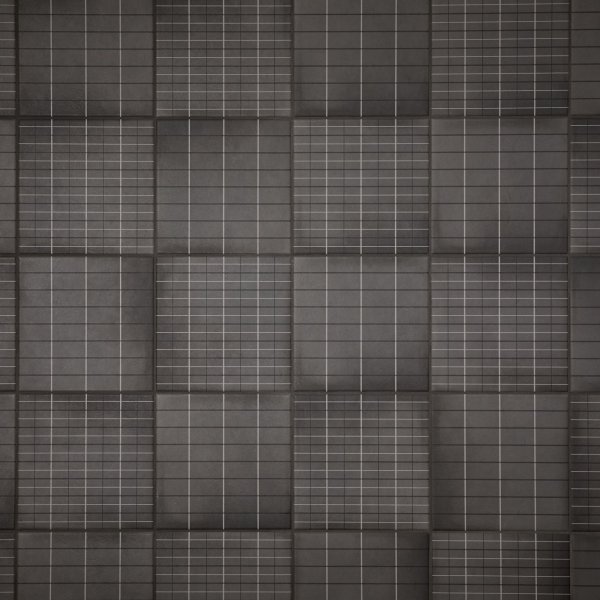
Large format works on continuity: fewer grout lines, less visual interruption, a space that reads as more deliberate than it might otherwise. It is the correct choice where you want the surface to recede and let the room breathe. Mosaic brings density and craft: it functions as a focal element, on a feature wall or in a compact space where visual richness is an advantage rather than a problem. Three-dimensional surface is the most demanding choice — and the most dependent on light. It changes character through the day and cannot be assessed from a photograph. The practical rule: large format to command, mosaic to surprise, three-dimensional for spaces you want to feel alive. La Mercanti holds samples of all three — the decision is considerably easier once you have the material in hand.
How to read a tile technical data sheet before specifying: the four values that decide whether a ceramic performs in a commercial interior.
Every tile has a nominal size and an actual measured size. The gap matters in large-format applications: a 2mm variance per tile compounds visibly across a 10-metre run. Confirm actual dimensions before setting out. The Italian collections carried by La Mercanti include dimensional tolerances in their data sheets — a detail that is standard for design-grade ceramics and absent from most volume ranges.
PEI 3 is light commercial. PEI 4 is heavy commercial traffic. The most common specification error is PEI 3 in a reception handling 80–100 visitors daily. For executive floor applications, PEI 4 is the minimum. Where the same collection is used across floors and walls, confirm the floor variant — surface treatments differ between the two, even within the same visual family.
Porcelain: ≤0.5%, suitable for wet areas. Standard ceramic: 3–6%, wall applications in controlled humidity only. A standard ceramic tile on an executive washroom floor is a liability regardless of appearance. The Italian porcelain collections in this range are all ≤0.5% — specified correctly for the environments where they are typically used.
Edge profiles, transitions and external corners are often produced in separate batches with longer lead times. Confirm availability and lead time for all special pieces before placing the tile order. La Mercanti flags this at point of specification. It is the detail that delays more installations than any other — and the one most often discovered too late.