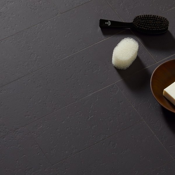
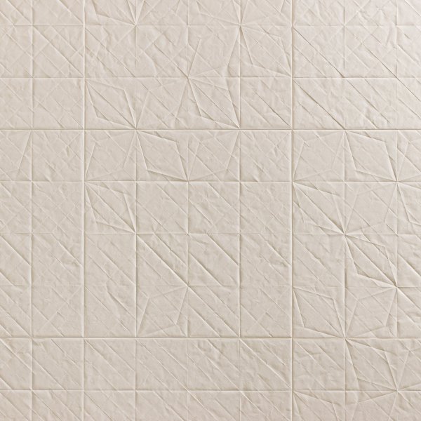
Homage to the Square porcelain surface by Mutina

Homage to the Square by Mutina — the greatest colour lesson, now in porcelain

Mutina

The Josef & Anni Albers Foundation

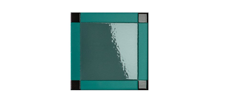
Evergreen
Evergreen Available now
£ 146

Let's discuss your project

Trade terms for professionals and design studios

No one taught colour like Josef Albers: at the Bauhaus, then at Black Mountain College, finally at Yale, he trained generations to see that colour never exists alone — «every perception of colour is an illusion... in our perception they alter one another». His textbook was a painting series: Homage to the Square, nested squares pursued for over twenty-five years. Now the lesson comes off the easel: Mutina, in collaboration with The Josef & Anni Albers Foundation, translates it into glazed porcelain — the newest collection in the catalogue (2026, registered design).

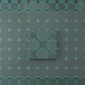
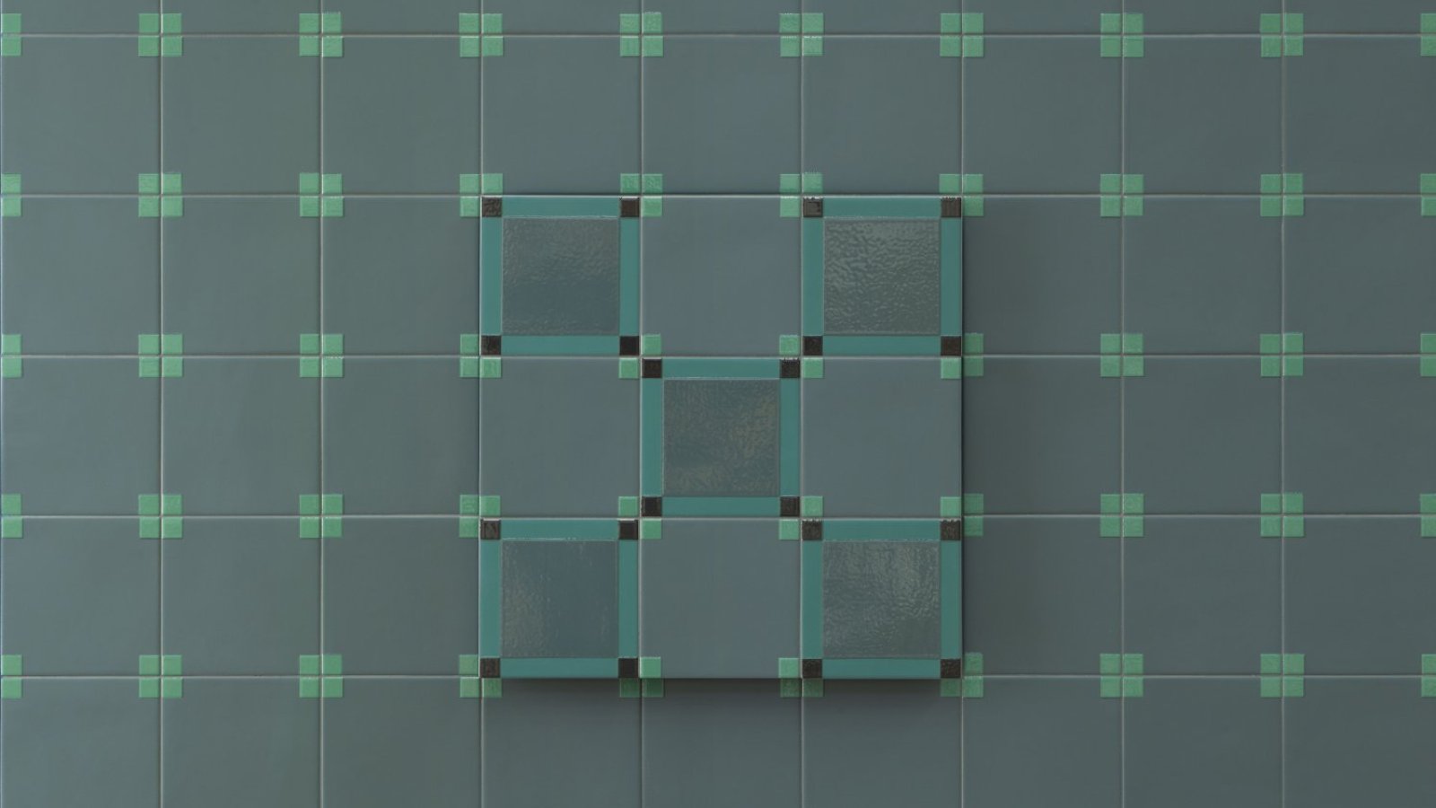
The module is a 15×15 cm square in glazed, unrectified porcelain — firing variations declared as a virtue, each piece unique — in two patterns built on matte and glossy glazes: Dash, a glossy section set within a matte frame with four small glossy squares at its ends (the nested squares, unmistakably), and Dot, a matte field with glossy squares at the corners. The 7 colours — Sea, Evergreen, Chocolate, Ice, Citron, Sage, Peach — are drawn from Albers's paintings, calibrated to the same saturation so the vibration survives the kiln.

Where the lesson continues

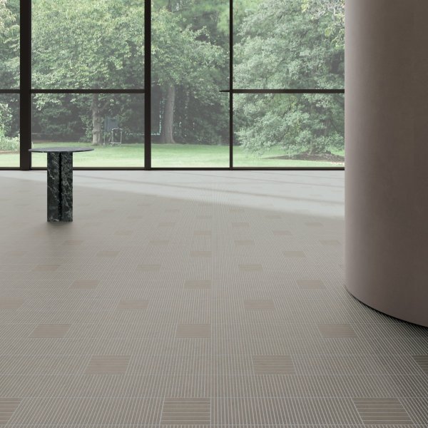
The syllabus is precise: Dot for interior floors and walls (stain class 5, R10, DIN B, DCOF 0.57 declared) and exterior walls; Dash for walls only, indoors and out — bathrooms, showers, receptions, boardrooms. Datasheet and certificates download from this page.

Technical information based on data declared by the manufacturer.

Collection: Homage to the Square
Manufacturer: Mutina
Design: in collaboration with The Josef & Anni Albers Foundation, 2026 — registered design no. 015139910-0001/0025 (23/04/2026)
Material: glazed, unrectified porcelain stoneware (UNI EN 14411 BIa GL), 9 mm (0.35 in) — natural firing variations declared
Format: 15×15 cm (5.9×5.9 in) (6"×6") — 44.44 pcs/sqm
Range: 2 patterns — Dash (glossy section in a matte frame, 4 small glossy squares) and Dot (matte field, glossy corner squares) — 7 colours drawn from Albers's paintings: Sea, Evergreen, Chocolate, Ice, Citron, Sage, Peach — Jolly trims on request
Use: Dot: interior floors and walls, exterior walls — Dash: walls only, indoor and outdoor
Declared values: absorption 0.15% — stain class 5 — acids/alkalis class A — frost and thermal shock resistant — abrasion PEI 2 to PEI 5 — slip (Dot): R10, DIN EN 16165 class B, DCOF 0.57, Pendulum 45/25 matt
Installation: 2 mm (0.08 in) joint, flat dry substrates; fine-grain grout on glossy parts, no abrasives; coloured grouts: sales office
Documents: VOC, EPD, SDS, HPD, Red List Building Materials on request — Packing: 30 pcs/box (0.68 sqm)

La Mercanti Srl — trusted supplier for design and contract projects since 1997.
San Benedetto del Tronto (AP), Italy · +39 0735 753833 · info@lamercanti.com
Supply, quotations, specifications and project support across the UK and worldwide.

Tell us which finishes you'd like to assess

£ 170

Fully redeemable against your first order

FAQ

Why is Albers called the century's greatest colour teacher?
Because three schools and two continents say so: he taught at the Bauhaus from 1922, emigrated in 1933 with Anni Albers to found the art department at Black Mountain College - the legendary American experiment - and from 1950 directed design at Yale. His method was the Homage to the Square series itself: nested squares painted for over twenty-five years to prove that colours «alter one another», culminating in a MoMA exhibition (1964) that travelled to twenty-two venues. This collection, developed with the Foundation that guards that legacy, puts the syllabus on the wall - literally.
What do Dash and Dot actually look like?
Two intensities of the same experiment, built from matte and glossy glazes rather than printed colour: Dash sets a glossy section inside a matte frame, with four small glossy squares at the ends - the nested-square echo is unmistakable - while Dot keeps the field matte and lights only the corner squares. Reflections move as you do; and because the porcelain is unrectified, firing variations are declared as a virtue: each piece is unique. One planning rule to respect: Dash lives on walls only; Dot also goes underfoot, indoors.
How should the 7 colours be combined?
By Albers's own rule: never judge a colour alone. Sea, Evergreen, Chocolate, Ice, Citron, Sage and Peach are drawn from his paintings and calibrated to the same saturation, so any two or three already converse - pairing them is the most faithful way to use the collection, because that is precisely what the paintings did. The practical corollary: sample combinations in the room's real light, morning and evening - «every perception of colour is an illusion», and the illusion must be seen on site. Sample costs are fully credited at order confirmation.
Where exactly can each pattern go?
The declarations are precise and worth respecting: Dot goes on interior floors and walls, and on exterior walls; Dash is cladding only, indoors and out - never underfoot. Outdoors, in other words, the collection climbs but is not walked on (frost and thermal shock resistance are declared for the vertical). For interior floors Dot carries a full slip file - R10, barefoot class B, DCOF 0.57 - so bathrooms and showers are in scope, with stain class 5 and class A chemical resistance. Abrasion is declared as a PEI 2-5 range: for hard-working floors, La Mercanti verifies the chosen colour's rating with Mutina.
What documentation comes with so new a collection?
The full birth certificate: registered design no. 015139910-0001/0025 (April 2026), a complete datasheet, and - on request through La Mercanti - VOC, EPD, SDS, HPD and Red List Building Materials files for specification packs. Logistics: 15×15 format, 44.44 pieces per square metre, 30-piece boxes (0.68 sqm), 2 mm joints with fine-grain grout on glossy parts; Jolly trims on request, coloured grouts via the sales office. Samples ship from La Mercanti, costs fully credited at order confirmation.

Hanging a lesson you can tile: Homage to the Square in five steps

Five steps for UK architects and clients: the century's colour course from shower wall to boardroom - patterns, placements and perception.

Choose the field of study
A shower wall, a reception backdrop, a boardroom: contained surfaces where colour can vibrate without noise.
Respect the roles
Dot underfoot (interiors only) and on any wall; Dash strictly vertical, indoors and out. Outside, the collection climbs - it is not walked on.
Compose by relation
Two or three tones together, never judged alone: the palette shares one saturation - let the colours alter one another.
Sample in real light
«Every perception of colour is an illusion»: check combinations in the actual room, morning and evening, before ordering.
Order by 0.68 sqm boxes
30 pieces per box, 44.44 per square metre: La Mercanti computes quantities per pattern and colour from the layout.

You May Also Like