Let's discuss your project
Trade terms for professionals and design studios
Let's discuss your project
Trade terms for professionals and design studios
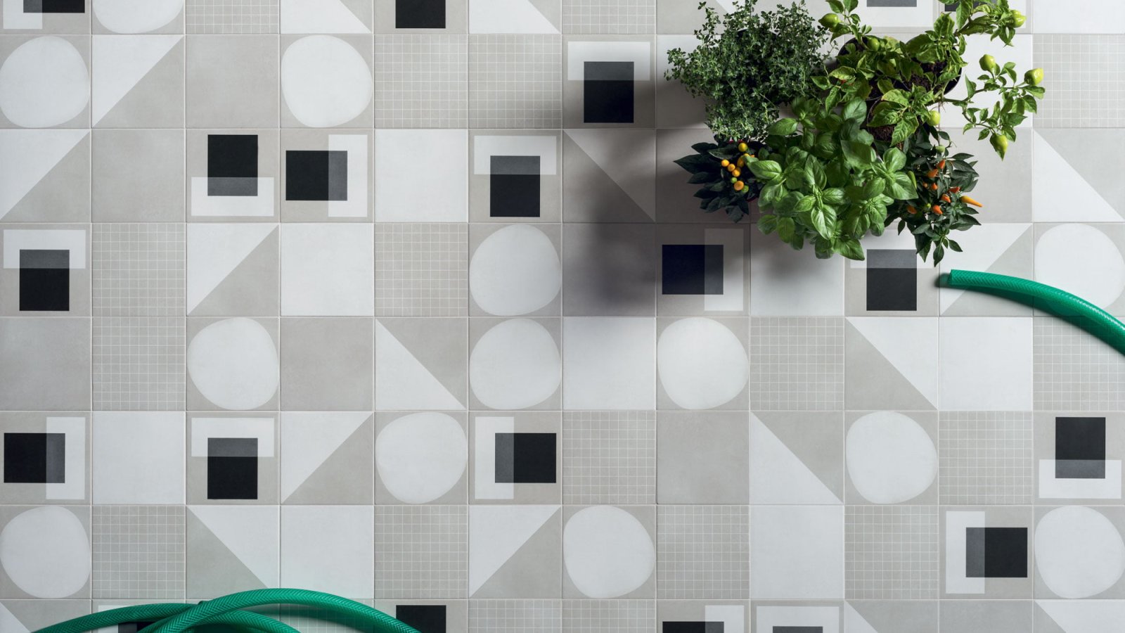
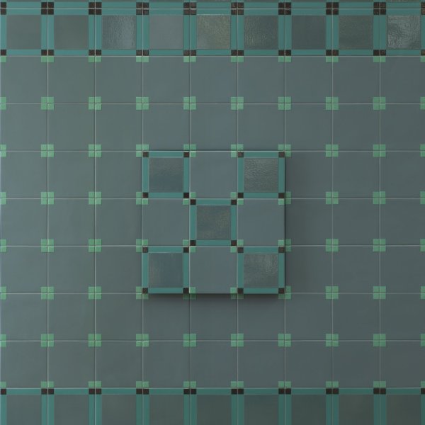
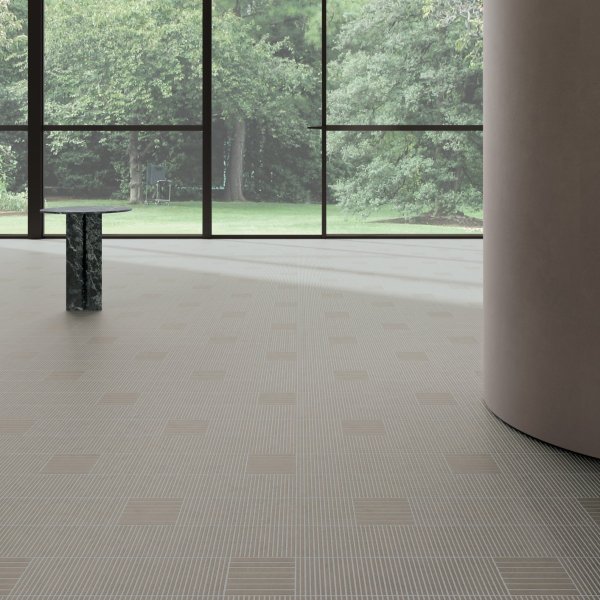
Open the Futura catalogue and look under the images. The lines are not captions in the usual sense, they are specifications: «Wall Futura Grid Black — Floor Drop Black». «Wall Futura Grid Blue — Floor Futura Drop Blue». «Futura Half Rose — Futura Rose / Drop White / Grey / T Rose / Drop Rose». 41zero42 tells you, room by room, which reference went where, and in doing so hands a British specifier something rarer than a mood board: a set of tested recipes that can be lifted straight into a schedule, with the wall and the floor written on separate lines because that is how they will be ordered.
It matters because Futura is not one product but twenty-four. Five grounds — the cement Grey at the centre, with Rose, Blue, Black and White around it — and nineteen decors, four families plus four pictorial designs. The tile underneath stays the same everywhere: HD digital glazed porcelain, 15×15 cm (6×6 in) with 10 mm of body (3/8 in), matt, abrasion class IV, R10, a DCOF of 0.50, stain resistance class 5 and 0.3% water absorption. La Mercanti delivers Futura into British projects and sets the mix against the drawing before the order, so the schedule reads like the caption: this reference on the wall, that one on the floor, in these quantities.
Collection: Futura, 41zero42
Manufacturer: 41zero42, Fiorano Modenese (Modena), Italy
Technology: HD digital glazed porcelain, BIaGL group
Size and thickness: 15×15 cm (6×6 in), 10 mm (3/8 in) — the collection's only size
Finish: matt (natural)
Grounds (5): Grey — the cement grey that is the collection's main colour — White, Black, Blue, Rose
Decorative families (4): T (White, Blue, Rose) · Drop (White, Blue, Rose, Black) · Grid (White, Blue, Rose, Black) · Half (White, Black, Blue, Rose)
Pictorial designs (4): Bird, Tubes, Microchip, Triangles
References: 24, each with its own code (4100516 Grey to 4100539 T Blue)
Appearance: inspired by handmade cement tiles; the manufacturer declares a semi-industrial process with variations in flatness and wedging and small irregularities on the glazed surface, plus a slight tone variation between grounds and decors
Recommended grout: Mapei 110 Manhattan for every colour
Joint: 3 to 4 mm (about 1/8 in) recommended; the manufacturer states that the same caliper between references is not always guaranteed
Water absorption: 0.3% (ISO 10545/3, required ≤0.5%)
Breaking strength: 46 N/mm² (ISO 10545/4, required ≥35)
Stain resistance: class 5 (ISO 10545/14, required ≥class 3)
Frost, thermal shock, chemicals: resistant, no visible alteration (ISO 10545/12, /9, /13)
Slip resistance: R10 (DIN EN 16165)
Abrasion: PEI IV — class IV (ASTM C1027)
Dynamic coefficient of friction: DCOF 0.50 (required >0.42)
Aesthetic class: V1 (ANSI A137.1)
Packing: 22 pieces per box, 0.50 m² (5.4 sq ft), 10.90 kg (24 lb); 125 boxes per pallet, 62.50 m² (673 sq ft), 1,362.50 kg (3,004 lb)
Declared sources: the Bauhaus, Pierre Chareau and the Maison de Verre, the beat generation, cyber style, handmade cement tiles

Tell us which finishes you'd like to assess
Technically yes: all 24 references are the same tile, so any of them can go up or down. The captions simply record what the studio chose in that room, and the floor values — R10, DCOF 0.50, abrasion class IV — apply to the whole collection.
Two things, and they go together. The same caliper between references is not always guaranteed, and a 3/4 mm joint is recommended as suitable for a natural product. On a 15 cm module that joint is part of the drawing, not a tolerance to be hidden.
41zero42 publishes a single recommendation for every colour in the collection: Mapei 110 Manhattan. One line in the schedule covers grounds, decors, light and dark alike.
No. The collection is deliberately not a rectified, perfectly calibrated product: flatness and wedging variations are declared, the glaze carries small irregularities and tone shifts slightly between grounds and decors. That is the handmade cement-tile look the manufacturer set out to obtain.
V1 under ANSI A137.1 means a uniform appearance from tile to tile within the same reference. The tone shift the collection text describes sits between references, and it is declared rather than accidental.
Five steps from loose tiles to a board the client can approve, so the mix is decided in the office and not on site.
Order loose pieces of exactly the Futura references you have drawn, grounds and decors: a board made of the wrong codes proves nothing.
If the scheme is one ground to two decors, set the board out in that ratio — the eye reads proportion long before it reads a single tile.
Keep 3 or 4 mm of space, the width 41zero42 recommends, and slip a strip of the grout colour underneath so the line is not imaginary.
Matt glaze changes with the light it stands in: judge the board on the wall it will cover, morning and evening, not under a showroom spot.
Write the reference numbers beside the approved pieces and send the board to La Mercanti with the order, so what arrives is what was agreed.