
Executive Office Suite: bespoke Italian furniture for directors
The leadership floor as a designed system: desk, cabinetry, seating and light specified to make the argument before you do.
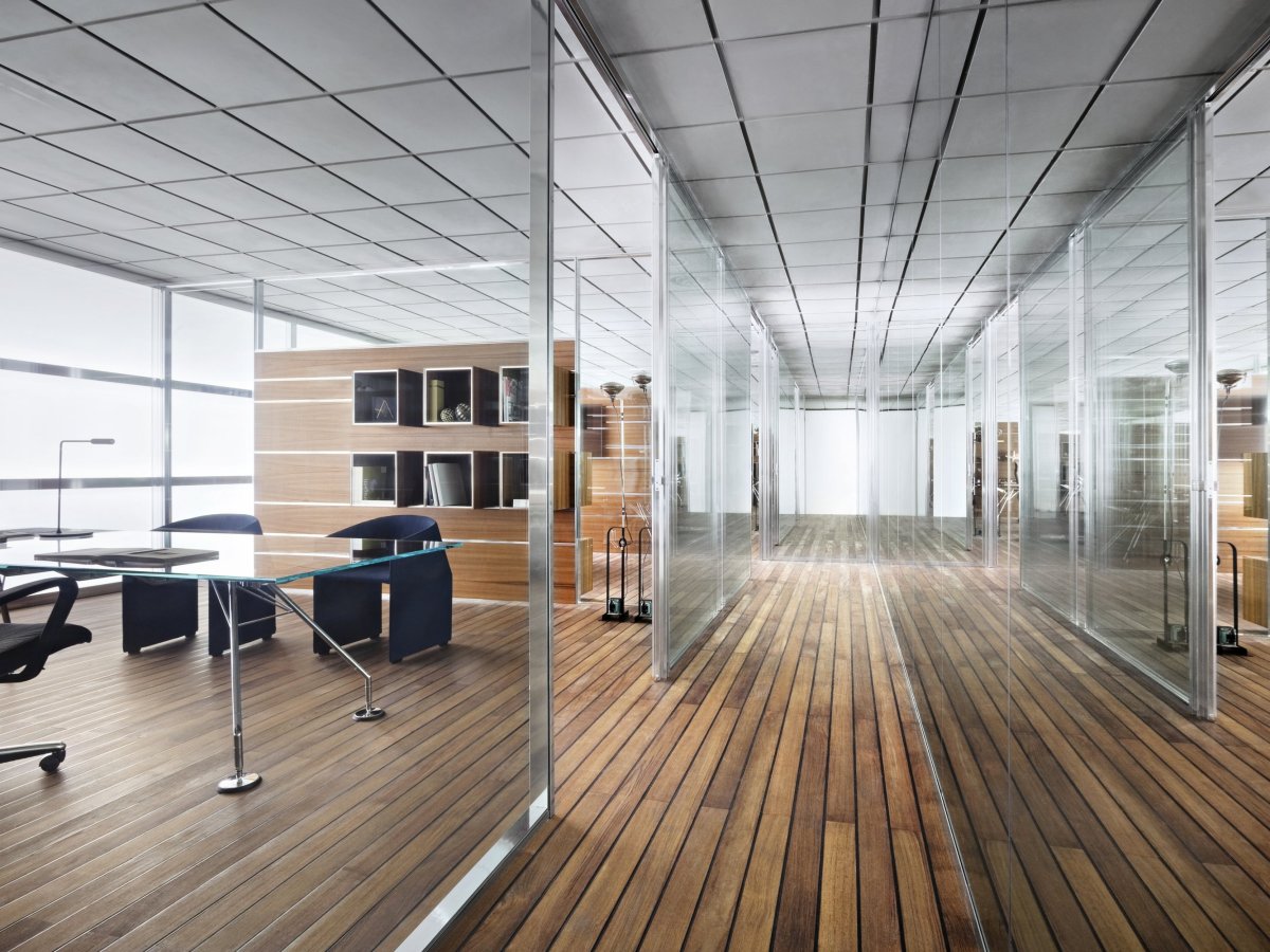
There is a particular kind of office that announces itself before anyone speaks. Not through size, not through obvious expense — but through the quality of every decision made in its composition. The executive desk positioned to command the room without dominating it. The proportions considered not for the photograph, but for the working day. The materials chosen because they will look better in fifteen years than they do today. This is what a properly commissioned executive office does: it removes the need for explanation. The space makes the argument. The person behind the desk simply gets on with the work.
Italian executive office furniture, designed around your brief. La Mercanti works directly with Italy's most considered furniture makers — supplying executive desks, director's seating, conference furniture and bespoke storage systems to architects, interior designers and facilities directors across the UK. Programmes are specified as complete systems: desk, cabinetry, seating and ancillary pieces from a single design language, with coordinated finish families and materials selected for sustained professional use. The distinction between a furnished office and a designed one is rarely about budget — it is almost always about the quality of the brief that preceded it. Samples and technical drawings are provided on request. We are glad to assist with your specification.
British executive offices carry constraints of their own: Georgian and Victorian floorplates with irregular walls and listed fabric that cannot take a fixing, glazed partitions that must hold a confidential conversation, and a leadership culture that increasingly wants the director visible rather than sequestered behind a double door. The answer is the same in every case: resolve the flows first — light, circulation, acoustics, cabling — and only then choose the objects. An office chosen in the right order looks designed because it was.
Inspiration




FAQ
Why does an executive office designed to impress visitors often make the person who works in it feel slightly wrong?
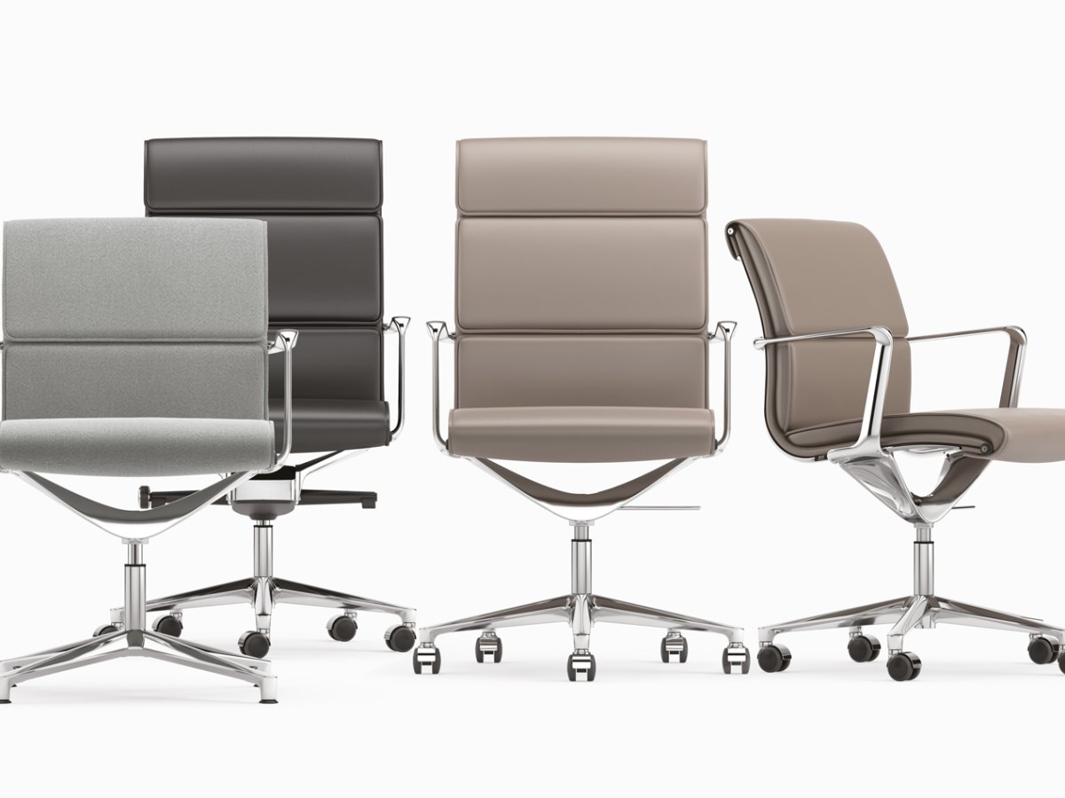
Because it was designed for the entrance, not for the working day. A room optimised for first impressions typically prioritises visual weight — large desk, high-backed chair, imposing storage — over the quieter requirements of someone who actually occupies it for eight hours: sight lines that don't cause fatigue, a desk depth that accommodates work rather than performs authority, a chair that supports posture rather than signals status. The paradox of the executive office is that the version designed to communicate power to others often undermines the quiet confidence of the person at its centre. The offices that work best for both — for the director and for the visitor — are the ones where that tension has been consciously resolved. Usually by a designer who asked the right question first: who is this room actually for. The honest test is a fortnight of ordinary use before anyone photographs it.
What does "bespoke" actually mean when an Italian furniture supplier uses the word — and how do you tell the difference between genuine customisation and a colour option?
In the UK contract furniture market, "bespoke" has been stretched to cover almost anything that deviates from the standard catalogue — including changing the fabric on a chair that comes in twelve fabrics anyway. Genuine bespoke in the context of an executive office means something more specific: the ability to alter dimensions, material combinations, structural configurations or finish families that do not exist as standard options, with production times that reflect actual manufacturing rather than warehouse selection. The questions that distinguish real bespoke from catalogue flexibility: whether the desk top can be produced at a non-standard depth — say 75 cm rather than 80 — without a surcharge that makes the conversation pointless; whether a finish from one programme can be applied to a piece from another; whether a storage system can be dimensioned to a specific wall rather than fitted around it. Italian manufacturers at the higher end of the market answer yes to all three, because their production model is configured for series of one. British buyers who have dealt only with volume contract suppliers are often surprised by this. The surprise is informative.
Is there a meaningful difference between how a British architect specifies an executive office and how an Italian architect approaches the same brief — and does it matter for the outcome?
There is, and it matters more than most clients realise. The British specification tradition tends to work from the room outwards — establish the constraints (dimensions, budget, programme, existing elements), then identify products that satisfy them. The Italian design tradition tends to work from the object inwards — establish the quality of each element as an absolute, then resolve the constraints around it. Neither approach is superior in every context, but the difference produces observable results when a project has tight parameters. The British method produces solutions that fit the constraints but occasionally sacrifice internal coherence — the desk that works within budget and delivery schedule but whose proportions were never quite right for the room. The Italian method produces objects that hold together as design statements but occasionally require more negotiation on the practical side. The most effective executive office briefs we encounter combine both: the British discipline of constraint-setting applied to a process that starts with the object's intrinsic quality rather than its price point. That combination is what a properly structured specification produces — which is why the brief is a design instrument, not a procurement document.
A director's office in a listed building presents constraints that standard executive furniture cannot address — what options exist, and what does the specification process look like?
Listed building constraints introduce requirements that eliminate most contract furniture solutions immediately: no fixings into historic fabric, dimensional irregularities that preclude standard module sizes, lighting restrictions that affect finish selection, and occasionally material restrictions linked to planning conditions. Italian manufacturers with a genuine bespoke capability are disproportionately well-suited to these projects for a structural reason: their production model already accommodates non-standard dimensions and material combinations as a matter of course rather than as an exception requiring special approval. The specification process for a listed context has three additional steps. First, a measured survey of the actual space — not the architect's drawings, which in listed buildings frequently contain inaccuracies accumulated over successive renovations. Second, a finish review that considers patina compatibility: a high-gloss lacquer in a room with original Georgian cornicing creates a period conflict that no amount of design skill resolves; a hand-oiled walnut or a matte stone lacquer sits within the same material register as the original architecture. Third, a structural assessment of floor loading if the specification includes stone tops or substantial solid timber. La Mercanti has supplied executive furniture to listed commercial and institutional buildings across the UK and can provide samples, drawings and installation guidance for heritage contexts.
How large should a director's office be in a UK headquarters where floor space is expensive and the culture is increasingly open?
Smaller than the tradition suggests and better proportioned than the budget usually allows. A working position with a desk, a chair and considered storage, plus a meeting setting for three or four people, fits comfortably into 18 to 22 square metres; below 14 the meeting collapses into two chairs across a desk and the visitor sits like a candidate; above 35 the room starts talking about distance, which is a message most British boards no longer want to send. What matters more than the number is the split — roughly six parts working zone to four parts meeting zone — and the placement: on the edge of the open floor, glazed towards the common areas, so that the director is seen to be present. The pressure on rents in London, Manchester and Edinburgh has done executive offices a favour: it has forced them to be planned rather than merely large, and a planned room of 20 square metres outperforms an unplanned room of 40 in every respect that counts.
Can the director's office double as a small meeting room when the director is travelling?
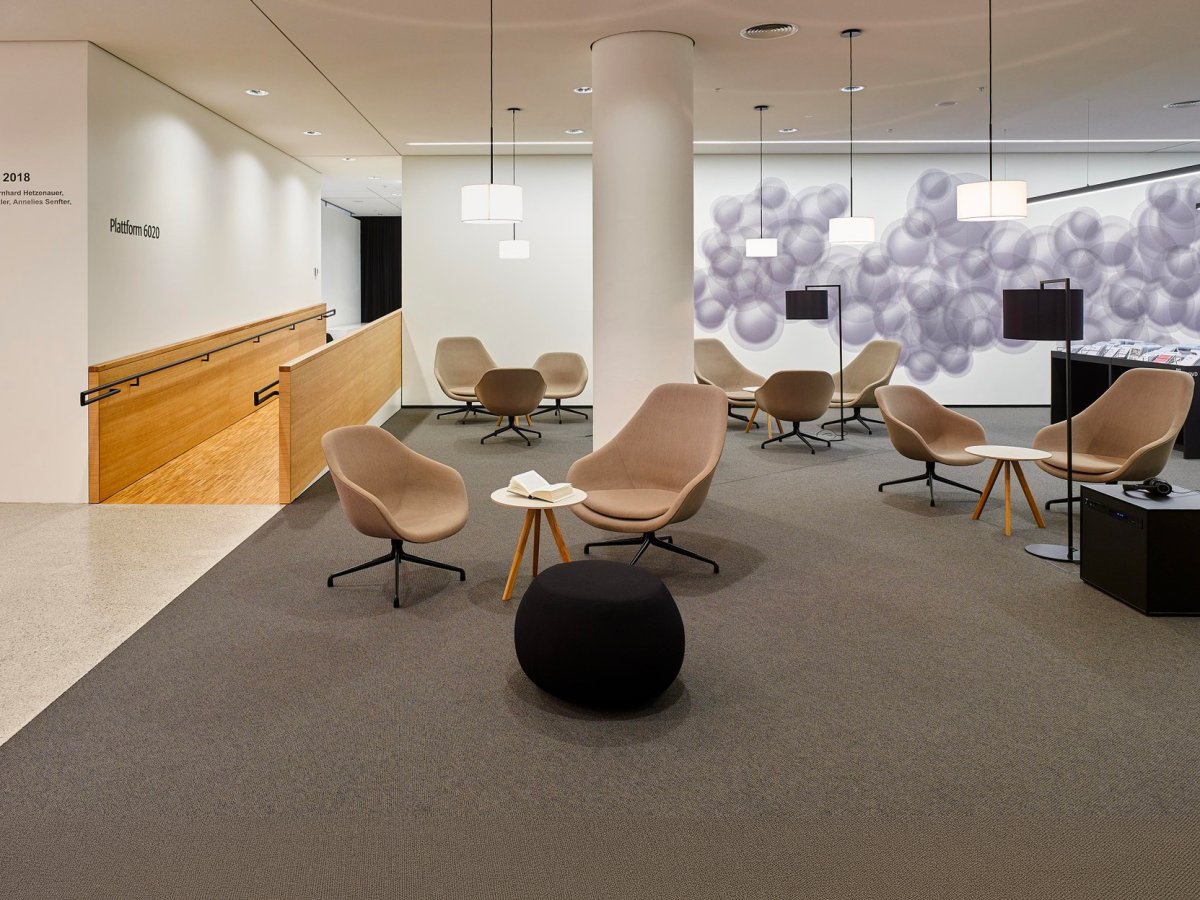
It can and it should; in most UK offices that shared use is what justifies the floor space. The condition is that the meeting zone is designed as a zone — a low table with four chairs, or a small round table — rather than as two visitor chairs pulled up to the desk. A wall-mounted screen turns it into a video room without a walk to the main suite, which matters daily for firms with teams split between London and the regions or between the UK and Milan. The desk should face away from the meeting zone so that a screen or a document cannot be read by guests, and the room should sit in the booking system like any other meeting room, with one rule — nothing personal left on the desk — and access managed by the executive assistant. Handled this way, the director's office stops being an empty room with a name on the door and becomes the most booked small meeting room on the floor.
How to write a design intent document for an executive office — a practical guide for architects and interior designers
Most executive office projects that disappoint do so for a reason that has nothing to do with the products specified. The desk was well made, the seating was correct, the finishes were approved — and yet the completed space felt assembled rather than designed. The cause, almost without exception, is the absence of a design intent document: a written articulation of what the space was meant to achieve before anyone opened a catalogue. It is not a brief, not a product schedule and not a mood board. It is a written argument in four sections, plus a check at handover, and it changes the quality of every decision that follows.
Section one — The occupant profile: who this space is actually for
The occupant profile is not a job title. It is a description of how the specific person who will occupy this office actually works — which is frequently different from how they believe they work. Write two paragraphs. The first describes the working pattern: what proportion of the day is spent at the desk working independently, what proportion receiving visitors, what proportion on calls or video meetings. Those proportions determine desk depth, storage configuration and the priority of acoustic separation. The second paragraph describes the communication objective: what the space should convey to the people who enter it, in specific, observable terms rather than the language of marketing. Approachable and collaborative, with seating that reduces the visual hierarchy, or formal and considered, with a clear separation between desk and meeting area. Writing these down as decisions is what distinguishes a specification from a selection.
Section two — The spatial proposition: what the room should do
The spatial proposition translates the occupant profile into a physical programme for the room, written before any measurements are taken and before any products are considered. For most executive offices it contains three zones. The working position, defined by its relationship to light (daylight to the side or behind the occupant, never in front of the monitor), by its distance from the door (a desk facing the door creates surveillance; one set at an angle lets the occupant choose when to acknowledge an arrival) and by its proximity to secondary surfaces. The visitor area, defined by its capacity, its character — chairs across a desk say something different from chairs around a low table — and its sight line to the desk. And the transition between them, the most neglected element: in a well-designed office, moving from work to meeting is a legible spatial event. Write the proposition first; then measure the room and see what is possible.
Section three — The material register: how the space should feel
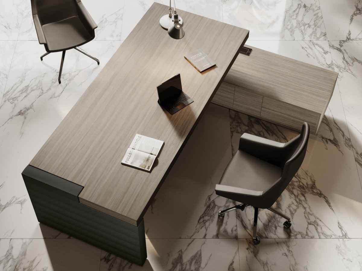
The material register is a written description of the sensory quality of the space — the weight, warmth, texture and reflectivity of the surfaces that will surround the occupant and their visitors. It is not a finish schedule; a schedule lists products, a register describes the experience they should produce. Write it in terms of contrast and hierarchy. Horizontal surfaces — desk top, storage tops, secondary tables — in a material that reads as substantial and warm, a fine-grained timber or a matte stone. Vertical surfaces that recede. Metal elements — handles, frame details, exposed structure — consistent across every piece and in the same tonal register as the hardware used elsewhere on the floor. The floor treated as a fourth material, not an afterthought. This description prevents the small mismatches that degrade a space: the desk in one wood tone, the storage in a slightly different one, the chair frame in a metal that almost matches the desk legs. Invisible when each piece is chosen alone, obvious when they meet.
Section four — The durability standard: what this office should look like in ten years
The durability standard is the section most consistently omitted from executive office briefs, and its omission is the most reliable predictor of a space that needs significant intervention within five years. Write one paragraph describing the expected condition of the office a decade from installation — honestly, in terms of what appropriate wear should look like for the materials chosen. A desk top in oiled European walnut will develop a patina; a white lacquered surface will not, it will show wear. These are different propositions, and choosing between them is a design decision, not a maintenance question. The standard should also set the replacement logic: which elements are expected to remain constant — desk, primary storage, architectural interventions, chosen for permanence — and which are expected to be updated, such as seating fabrics, budgeted for periodic renewal. Writing this distinction into the brief clarifies where the money goes and prevents the classic error of over-spending on what will be replaced.
Handover — Test the finished room against the document, not against the photographs
A design intent document earns its keep at the end, when the room is installed and the temptation is to sign off on how it looks. Instead, read the four sections again with the director in the room and check each claim against reality. Does the working position sit where the light was meant to fall, and does the monitor stay readable at three in the afternoon in October. Does a visitor move from the door to the meeting zone without crossing behind the desk. Do the timber tones, the metals and the floor belong to one register, or has a late substitution crept in during the fit-out. Does the fabric choice match the replacement logic that was written down. Then let the director use the room for a fortnight, with at least three confidential conversations and two client visits, and correct the small things — a blind, an extra chair, an acoustic panel — while they are still cheap. A room that passes this reading is designed; one that only passes the photograph is furnished.